Opening a bank account in the middle of a tax return.
Designed and tested Spruce banking enrollment for H&R Block's Assisted tax journey, centered on the Tax Pro workspace and customer companion monitor while coordinating with adjacent digital surfaces.
- Role
- UX/UI Designer
- Timeline
- Feb – Aug 2022
- My scope
- BlockWorks (Tax Pro workspace) and the customer companion monitor
- Worked with
- Product, Engineering, Legal, Content, UX Research, Tax Pro stakeholders
Tax Pro workspace BlockWorks, desktop
Return workflow
- Client information
- Return summary
- Refund Options
- Consent Summary
- Joint Offer
- Federal Refund and Fee Options
- Review and sign
- Finish
Financial products
Joint Offer
Review account options with your client.
- Client
- New Spruce client
Compare accounts
Spruce
Mobile banking
Learn moreAccount details
Emerald Card
Prepaid card
Learn moreAccount details
Refund method
How would you like your refund?
Review account terms before recording client consent.
Customer Companion monitor
Make room for what’s next.
Meet Spruce, from H&R Block.
Explore Spruce with your Tax ProRegulated financial enrollment inside an existing enterprise journey, shaped by legal copy, platform lock-in, Tax Pro usability, and customer comprehension.
Context
Spruce was a new banking product being introduced into H&R Block's existing tax flow. The offer was regulated, and the flow it joined already spanned multiple products, handoffs, and user types.
My work centered on the in-office integration across tax-prep software and the customer-facing companion monitor. I coordinated with peer designers working on adjacent online and mobile touchpoints so the Assisted experience remained coherent with the broader product system.
Mapping the tax journey
Before designing screens, I worked with stakeholders to inventory H&R Block's products, service paths, and decision points. Customers entered different paths and saw different combinations of offers depending on channel, product context, and progress in the office.
I used flow maps and working boards to find where Spruce prompts belonged, where they would create friction, and which adjacent teams needed to sign off on overlaps. The mapping showed where deeper integration was required and where lighter alignment was enough.
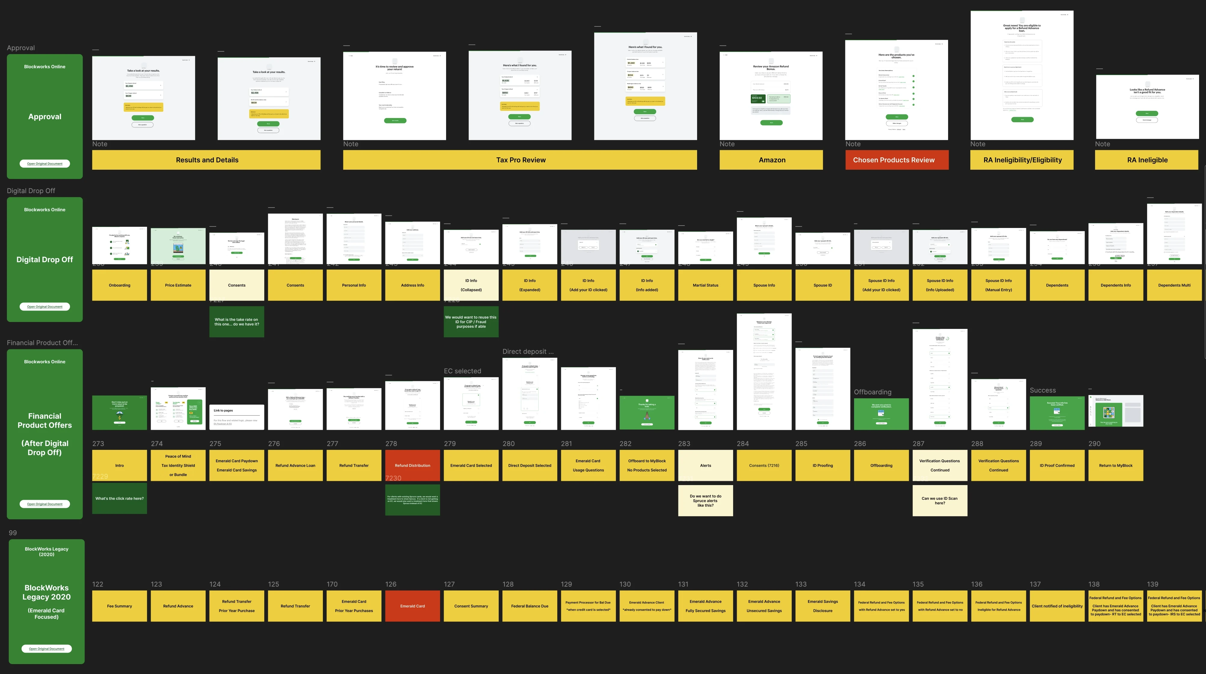
Approval
Amazon, Chosen Products Review, then Refund Advance eligibility.
Financial Product Offers
The note under Refund Distribution: For clients with existing Spruce cards, we would want a treatment here to show Spruce. If a client is not getting an EC, we would also want a treatment here that shows Spruce instead of EC.
BlockWorks Legacy 2020
Labeled "Emerald Card Focused" on the board and mapped as step labels without screens.
Conditional logic in BlockWorks
The in-office software had tight UI and technical constraints, so new architecture could not be invented freely. I focused the wireframes on conditional logic, decision sequencing, and message clarity inside what the system could support.
- Earlier steps
- Refund Options
- Consent Summary
- Joint OfferThe Spruce offer appears here
- Federal Refund and Fee Options
- Review and sign
- Added between consent and the refund and fee options.
Client state
Customer Companion monitor
A choice for your refund.
Compare Spruce and Emerald Card.
Mobile banking
An account option for your refund.
Continue enrollment on your phone.
Prepaid card
A card option for your refund.
Review the details with your Tax Pro.
New Spruce client: the Joint Offer screen appears on both surfaces, and the companion monitor adds a Spruce offer callout.
Tax Pro and customer screens
In the office, the Tax Pro worked in one software environment while the customer followed parts of the process on a companion monitor. The two screens had different jobs.
Usability testing showed customers were quick to feel overwhelmed when too many options or too much product explanation appeared at once. Tax Pros often preferred denser screens because the detail helped them explain choices and sell related H&R Block products. I simplified where customers needed confidence and speed, and kept density where Tax Pros needed context and control.
Tax Pro workspace BlockWorks, desktop
Return workflow
- Client information
- Return summary
- Refund Options
- Consent Summary
- Joint Offer
- Federal Refund and Fee Options
- Review and sign
- Finish
Financial products
Joint Offer
Review account options with your client.
- Client
- New Spruce client
Compare accounts
Spruce
Mobile banking
Learn moreAccount details
Emerald Card
Prepaid card
Learn moreAccount details
Refund method
How would you like your refund?
Review account terms before recording client consent.
Detail · Spruce comparison
Spruce
Mobile banking
Learn moreAccount details
Detail · Emerald Card comparison
Emerald Card
Prepaid card
Learn moreAccount details
Detail · Refund method
How would you like your refund?
Detail · Disclosure and consent
Review account terms before recording client consent.
Enlarged details from the desktop Tax Pro workspace above. BlockWorks is a desktop workstation tool; there is no phone version.
- ComparisonSpruce and Emerald Card side by side.
- Refund choiceAll three refund methods in one place.
- Disclosure and consentKept with the Tax Pro, next to the consent control.
Customer Companion monitor
A choice for your refund.
Compare Spruce and Emerald Card.
Mobile banking
An account option for your refund.
Continue enrollment on your phone.
Prepaid card
A card option for your refund.
Review the details with your Tax Pro.
- One offerThe same choice, with far less on screen.
- Offer calloutShown or left out, depending on the client.
- Next stepA prompt to ask the Tax Pro.
The in-store handoff, including QR-based sign-up on the companion monitor, came from working through what information was legally passable and what was merely distracting.
Customer Companion monitor
Your next step. On your phone.
Scan to continue enrollment on your own device.
Spruce, from H&R Block.
Customer Their own phone
Testing and decision paths
I partnered with H&R Block's research team on multiple rounds of usability testing with customers and Tax Pros, moving from wireframes to higher-fidelity prototypes. Each round tried different copy densities, sequencing, and sign-up prompts. Changes that came out of testing:
- Removed nonessential legal copy from the companion monitor and parts of the Tax Pro flow where it added friction without helping decisions
- Reframed the offer around refund timing to match what users expected
- Refined choice architecture and copy to make decision paths clearer
- Let users continue through earlier steps without forcing an immediate sign-up decision

Refund Distribution → Emerald Card Selected. The note under Refund Distribution asks for a Spruce treatment for existing Spruce clients and for clients not getting an Emerald Card.
Refund Distribution → Direct Deposit Selected.
Offboarding → Return to MyBlock.
Outcome
My 2022 work covered the design and testing of the Assisted Spruce integration. H&R Block publicly reported that Spruce launched in the Assisted channel in January 2023, the following tax season. This case does not claim that every proposed state shipped unchanged or that later adoption and business results were caused by my design work.
Have a complex
product problem?
If you’re hiring for senior, hands-on product design, I’d like to hear about it.
brianmartinux@gmail.com